Showing posts with label behind the scenes. Show all posts

Friday, October 11, 2013

Narrative and Character Development > behind the Temptation of Howard Bolam pt. 2

The Temptation of Howard Bolam was an interesting moment in the story to intentionally set our two protagonists against each other for a moment to explore how far they've developed since the beginning of their tale
Compare the rough pages with the finished pages at this link.
Casey is willing to stand up for his beliefs.
Of course we can remember Casey Miller being the timid, self-conscious scientist who was too conservative to let his imagination provide inspiration or motivation. Yet, when faced with higher stakes, for love, career and even for his life, he's had opportunities to confront his inhibitions and tackle obstacles head-on.

In the second half of this scene, he swallows his fear and jumps at the chance to not only stand up to Howard but also to the hulking Turk (who apparently has been hired as a security escort for the Sadducees).

And at the same time, Howard Bolam doesn't appear to have learned anything, he remains willing to sacrifice what he knows to be "the Christian thing to do," for personal gain and advantage. We know that this brings him shame and discomfort, but he's never felt that shame so much that he's ever resolved to discontinue taking advantages when they present themselves. 

There's an inner fury Casey releases, which continues to overcome unsuspecting antagonists.
I felt an extended action sequence to be overscored by the narrative exposition might be a balanced and enjoyable way to tell this part of the story. I probably should have used this method earlier and much more often! A lesson learned.

One of the initial mysteries I set up at the beginning of the story was, "Who was in the tomb beneath the church at Gobekli Tepe," if you can recall (here's some help, if you can't). While I was editing/rewriting the third act before publishing the pages, I realized I hadn't really answered that question, though I had fully intended to.

In any case, this answer was shoehorned back into the story, and probably isn't as rewarding a payoff as I had hoped. BUT it does satisfy some of the mythology I constructed in Lazarus's life story - - that one of his sisters, either Martha or Mary, had continued to spread the word of Christ and opened "ministries" outside of the Roman Empire to build the church.

And as the archaeological intepretation allows, great monuments and churches were built on top of the tombs of some of the most reverant leaders of the first church (like Lazarus's tomb beneath the chuch in Lanarka).

Follow on Twitter or Facebook!

Friday, September 27, 2013

Behind The Temptation of Howard Bolam pt. 1

The Temptation
The Temptation of Howard Bolam is a scene that I'd been waiting a long time to publish. It was something I'd planned the "Set up" for years ago, back in the first act I Tend to Agree With Your Partner.

I wanted character to motivate changes in the story just as much as the adventure - - I feel like this was something that was bound to payoff down the line - - that Bolam would be tempted to throw Casey under the bus again to save himself.

(If you clicked on that link - - think about how far the story has come since back then when they were still working at the museum. It's pretty cool. PLUS, that was freaking December 2010 when that was published. This story has been going on for a while now!)

Pacing
Ultimately, for the sake of pacing, I felt that 6 pages was too long for a scene to be. I felt that people would be impatient if it were too long, so I split it in two. This is the first time I've done this, and... well, perhaps you would have been fine with it if it were six pages long?

Let me know, I guess. In any case, I wanted the scene to be "finished" so I could say it was finished, because I feel people might wait for a few pages (or a scene) to accumulate before they check in on the site.

That was the impetus regarding publishing this in two parts, anyhow.


Check out the finished pages at The Temptation of Howard Bolam, pt. 1

The stick of straw in "The Turk's" mouth was just for fun in the rough draft, he felt like a grouchy rancher thwarting tresspassers when I drew him.
I raced through these pages while I was at my cottage back in the summer - - when I drafted out the rest of the story. You can see I was really racing through it, I didn't leave any details on the background at all.

Trivia
I'm not sure if these are facts, but I suppose it's interesting "trivia" if you ever wanted to know. I liked the name because it reminded me of both The Passion of the Christ, and The Life and Death of Jeremy Bentham (from Lost).

In my original draft, the final few pages were adapted into a series of scenes to accomodate pacing and narrative flow. This prevented it from being just a bunch of dialogue - - and I think the next scene illustrates a balance between action and diction.

Beyond "The Turk," I don't have a name for the big guy that's holding the gun, and I don't think I actually refer to him as "The Turk" in the story. So, his name is an unspoken secret between you and I. How do you like that!?

Drawing a guy holding a rifle is hard.


Anyhow, follow on Twitter or Facebook!

Friday, July 26, 2013

Guest Strip for The Comic Community

I had a neat opportunity to write a guest strip for a webcomic writer I'd discovered on Twitter, which was a first of its kind for me. Check it out here.

I hadn't produced a comic for another site before (although the Fundraising Faux-Pas series was designed with a fundraising consultant in mind).

@TheComicCom simply tweeted out to see if anyone were interested in drawing a guest strip, and I jumped at the chance.

Shortly we connected, mostly via Facebook, and he gave me a few comic ideas. I picked one I liked. Truth be told, I hadn't really done a zombie comic before, which is crazy - - I've drawn zombies, but nothing with a story or anything.

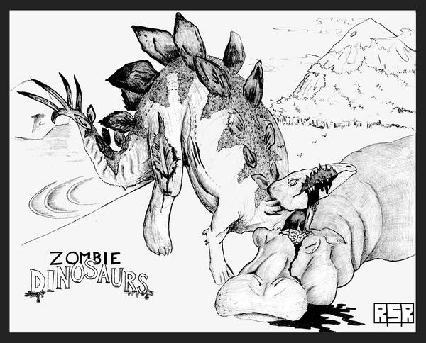
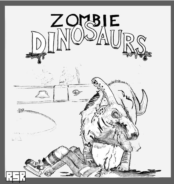
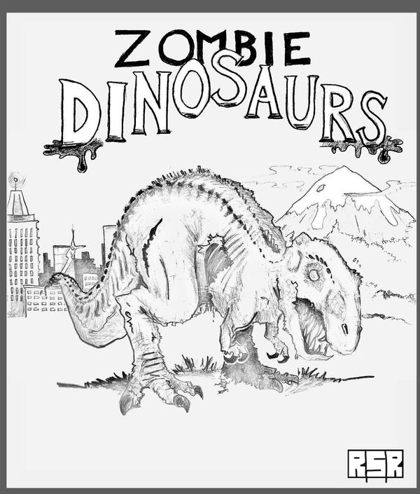
Dinosaur Zombies, on the other hand, I have had a chance to experiment with (like the zombie brachiosaurus, zombie stegosaurus, zombie parasaurolophus and a zombie t-rex (and I've got a bunch of neat new ideas on that front!).

So I drafted a quick blurb using his ideas and made a very rough mock-up of what it might look like.


He responded with a thought about omitting any reference to Jane Austen and the "Pride and Prejudice and Zombies" book series, and perhaps have the incoming zombie be a bit more confused about the whole situation. Which I was happy to incorporate.

He'd considered including some of his own existing characters, or adding some dialogue, but ultimately just left me with those two quick thoughts.


He mentioned that he was unsure of his Internet connectivity in the near future, so I set to work the very next morning to get it on paper, and ready to be coloured right away. My wife was really good about it, helping out with our son while I spent a little extra time working on it that morning, just to make sure it was ready in time.

The outline looked like this. With so many characters in the scene it was a great opportunity to tell a few stories at once, and I think it worked out well.


There's Mother, The Castigator, The Idiot and the Zombie. Everyone's story moves forward just a little bit, ironically, except for the subject of the joke, The Idiot, who is just taking everything in as it happens.

I had a fun strip earlier where there was some story development for a series of characters in a series of scenes that went with the King St. Capers - - which you can check out if you'd like.

Ultimately, this type of a strip is a LOT of fun to draw and write. There's so much going on that it leads to multiple readings and a series of different elements of humour. A real favourite.

Then there was the colouring!


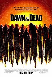
I wanted the window to resemble (in part anyhow) the Dawn of the Dead (2004) DVD artwork, and I think it translated nicely.

Last step was the lettering to make the final product which you can find HERE. I hope you liked it.

Thanks again to my wife for helping make it happen, it would have been a real struggle without her support.

Friday, July 12, 2013

Concept Art | Business Man @ Home

Behind the Scenes of creating the new series, Business Man @ Home

The Premise: "Business Man @ Home" is a cathartic exploration regarding how toddlers are absolutely vacant of any professionalism whatsoever.

Follow on Twitter or Facebook!


Here are some of the thoughts I had on designing this new series.

So here is some of the concept art I threw together when I was thinking up what I wanted Business Man @ Home to look like. To keep it simple (read, fast to make) I wanted to retain a real minimalist appearance, and not get too bogged down with backgrounds and things like that.

In my head, I had "Herman" in mind, and jotted down Jim Unger's name. By that I mean, a single-paneled gag without too much attention to the background. Like this:
Herman is so funny!
I took a little time to draft up the Header for the comic, too - - which I felt would be neat if it resembled a corporate ID badge, similar to this:

The bar code, picture and details are featured in the header.
And the design for the main character was meant to imply a very menial job, but one that has to be taken seriously, anyhow. Maybe it's in sales or whatever, or "account managers" but I really wanted to make the characters look like that dude from the Men's Room door.


But of course, he must appear more "professional," so he has a jacket and tie to go along with it. Of course!

I hope you like it!

In a way, there are some similarities with Bill Taylor's Cautionary Tales that embraced a "caution sign" aesthetic to tell its jokes. I hope this can be half as interesting as what he has accomplished.

Anyhow, if you ever have any questions, feel free to ask - - I'd be happy to respond. 

Sunday, July 7, 2013

Kodikas Galanos and balancing panels

Code Blue - - which in hospital slang is generally used to indicate a patient in need of immediate medical attention. Switch that into Greek, Cyprus' national language (along with Turkish, I understand) and you've got the name of the latest scene, Kodikas Galanos.

And not to be too confusing with the language switche-r-oo, I even made a point to specifically point out that Blue in Greek is Galanos way back on page 130. So that's where the name comes from, if you were wondering.

Once again, I wanted to keep the scenes short, for two reasons; first, it quickens the pace of storytelling, which is more exciting for readers (I hope) and second; it's more interesting for me to write and draw these scenes when they don't take a whole month to produce.

I hate drawing cars - - I totally avoided even sketching a car in this page. I just hate it.
I felt in an earlier scene that the downpouring rain turned out nicely, or at least accomplished what I hoped it would visually, so I was eager to include it again, and this seemed like as good a time as any. There was no call for rain in the script.

The script did, however, feature more gesticulation and language barriers between the motorist and Ian Escutcheon, but ... again ... for the sake of brevity, I eliminated that. Perhaps it would have been better if this were a more comedic moment, but the urgency I was hoping to imply didn't allow for it.

I couldn't fit the image into a quarter panel at the top, so I turned it into a banner-shape on the fly.
Sometimes the images don't fit, and instead of redrafting them, I just change it on the fly, without even erasing the guidelines. It doesn't feel necessary to be too refined in a quick draft. What's most useful when I'm putting these draft pages together is finding a way to share the images in a balanced manner.

For example, in the above page, four consecutive square panels might have looked a little to "geometric" or "blocky," and could have been a visual distraction. That might be useful at some point, but it didn't feel like a natural fit in this scene.

If I understand correctly, most comics writers draw on much larger sheets of paper, and then they're scaled down to fit into the standard comic book format, whereas I simply use 8.5"x11" common stock paper. When you've got a larger page, you have more room to do creative things with the panels, and add a lot more detail, which is later shrunk down into a really fine piece of work.

It'd be neat to try some time - - in fact, I actually used one and a half pages to draw this page: 
 
Follow the link to get a closer look, but I meant to put a LOT more detail into this page, because I wanted to really impress the spectacle of entering the Church of St. Lazarus. I think it turned out really well, though, if you look, in the middle panel amidst the seats, you can see the seam where I married the two pages together to complete the final image.

At first glance, I'd hope you wouldn't notice it - - granted, now I've pointed it out, it probably sticks out unavoidably.

The reason I did this was because I wanted the three saints hanging on the wall behind Dr. Miller to be more detailed than a small panel would allow. If you're familiar with your old saints (I'm not, but IF you are) you might recognize Saint Demitrius, Saint Moses the Black and Saint George the Dragon Slayer.

I think the added effort was worth while.
I wanted them to appear as faithfully as I could reproduce them. When they're just the size of a half of a dime on the original page I'm working on, it's hard to include any more detail than a mere shadow. Taking the extra time to draw them much larger than usual, and then shrinking it down, made all the difference.

ALL of that being said, finding a nice balance on a small page can sometimes be a challenge, I guess that's what I was trying to say.

Thanks for checking in - - if you have any questions, let me know, I'll be happy to answer them.


Saturday, June 15, 2013

Production Notes | Spring Chickens and King St. Capers

What I'm sure nobody's wondering is: what do the comics look like before you're done with them? Well, to answer the question nobody's asking, HERE's what they look like.


Here's we've got the Silent Pirate fan art, kitty sniff, Call Me Gail and the neighbourhood cat's middle finger.
Here we've got Ignacio, from Silent Pirate; Call Me Gail which was my twist on an expression that's a bit of a pet peeve of mine; the Neighbour's Cat; and Fishy Smell.

All of these come from the time before I learned how to add colour to the strips. You can see that I try and speed things up by drawing a bunch on one sheet of paper, then scanning them all at once, and doing the finishing touches digitally. 


Indoor v. Outdoor cats, microadvertizing, laptop kitty and Fretting over brownouts.
In this image I squished two multi-panel cartoons into one quarter of a page - - this can significantly reduce the detail, and make the images small to work with when adding colour afterwards. A lesson learned. Plus, when deleting the whitespace before adding colour, the smaller the details and images, the more difficult.

Here we've got The Difference Between Indoor and Outdoor Cats; Microadvertizing; Cybercrimes; and Fretting Over Brownouts.

I've had the rough draft of Indoor v. Outdoors cats drawn for literally three years before I got to it. I didn't like how it looked, so had to completely redraw it -- and of course it's for the better. Adding colour has made a significant difference, I think.

The Dahmer gag was another joke that'd been in the back of my mind for years and years - - now that I'm drawing up a bunch of the comics, it was time to finally get it done.

When I'm finished with a page, I'll order them to be published with the what I feel is the strongest cartoon to go first. From the above selections, it went Brownouts, Cybercrimes, Indoor v. Outdoor and then Microadvertizing. How would you have ordered them?


Great work and Cuddling Experience
Here's a quick example of two images where I was still making the shift from heavily shaded images to clean outlines to simplify the colouring process later on down the line. It looks like I've left some notes on the page for me while in the digital editing process, too.

In Great Work, I was really pleased with how the shading in the boss's suit turned out. It gave me hope that this could have some positive returns going forward.

My wife is still haunted by Cuddling Experience, which is unfair, because it was more of a joke than a critique, but also an observation ;)


The Hot Tub Drops on King St.
For the Hot Tub story arc for the King St. Capers, I tried something entirely different than what I'd been doing with other strips. Instead of drawing an entire gag in one cell, I chose to draw strip elements that I could incorporate into a series of gags. In this case, the image of two people observing the hot tub can be used in any instance when these people are observing the hot tub.

In Someone Leave Their Hot Tub, panels one, two and three were used; in Hot Tub in the Middle of the Street, I used panel four and another panel from a second page (there were four used in this story arc); and I reused panel four again in What Could Be Worse Than That?

I have to say, adding colour to the Capers has brought a LOT more life to them, and I'm even more happy with how they're turning out these days. The digital editing is making a lot more interesting stuff possible, as well.

Just one further example is, I've only had to draw the barber pole outside Mr. Minestrone's shop once, and then reused it every time - which is much faster than drawing and colouring a new barber pole every time. Same thing with the pile of butts and the pile of empty liquor bottles.

Monday, June 3, 2013

Production Notes | Spill Your Guts

Once again,  I have to note, Spill Your Guts is a scene that I conceived early in the writing phase for the story and have been looking forward to creating for years and years. It's taken that long to get here, but I think it's worth it.

It seemed a showdown in an abandoned slaughterhouse would be incomplete without resorting to a captive bolt stunner -- traditionally you'd see people hanging from meat hooks, but this was something I thought would be a good balance between gruesome and effective.

I was a little dismayed a few months ago when I was watching Person of Interest (I think) when the protagonist grabbed a captive bolt stunner and executed a combatant, too, stealing a bit of my thunder, but that was at the same time when How I Met Your Mother also created the "Bro Bibs" which encroached on my "Gentleman's Bib" idea -- frankly, it's stupid that there isn't a classy  apron or bib out there we can wear to protect our three-piece suits when we're sipping on lobster bisque.  RIGHT?!

Another scene where I've tried to balance plot, exposition and action - - though they have to occur sequentially instead of concurrently. But perhaps later on I'll have another go at it.

The circled numbers all over the page are measurements - - I freely sketch the cells and images during the conception drawings, and then measure them a bit more accurately for the good copy. For the horizontal measurements, I usually just turn to a cell being 1/3, 1/2 or 1/4 of the page's width, rather than measuring it out specifically.


Sometimes in the rough sketches I find I REALLY like how an image looks, and I have trouble duplicating it - - like when Mugabe is glaring up at Miller after being tossed into the stall. I worked hard to make sure that image was as close to the concept drawing as I could. I think it worked out - - other times I haven't been so lucky.

In the final page, I wanted Mugabe to look like he was preparing for a coup de grace, accepting his fate -- and I thought that came through well in the scene above, which is probably why I was hoping to recreate that cell as closely as possible when drawing the good copy.

As we near the midway point of Act III, of course we're probably hitting the point of no return for most of these characters - - Miller has now committed murder, everybody is show, slashed, tortured and beaten, and they realize that the stakes are pretty high, even if they seem pretty ridiculous (is releasing another plague on the earth a cool villainous plot or a bit farfetched?)

However, "releasing a plague" does live up to the "He wants to kill everyone" remark from earlier, which might have been difficult to live up to when you read it at the end of Act II.

I hope some of these production notes are a handy complement to reading the story as we go. I'm happy to answer any questions, too.

Thanks.

Saturday, May 25, 2013

behind the scenes for "Saves the Day"

Here are some more behind-the-scenes rough work when I was prepping the latest scene, Saves the Day.


While writing this whole story, I wanted Evelyn to be a motivation for Casey, but I didn't really feel it was right to have her be a burden, or bait, or the damsel in distress all the time. However, she's young and a bit reckless, perhaps a bit moody, and obviously spontaneous - - something you'd expect in a student, and perhaps not in a professional academic.

In any case, I'd like to think this played out well in this scene, when Mugabe expects he can threaten her to save himself, when in reality (in every other instance when Casey isn't in berzerker mode) Evelyn is by far the more dangerous captive.

I hope after a brief flash of mortal action that you're prepared for a few more talkative scenes of exposition.

There's something to be said for the clever Batman and Spiderman scenes where the exposition can be revealed during a duel, as they parry and lunge they spar verbally as well. Alas, this scene would have been prohibitively long and I just don't feel I have the patience to put people through much more than four pages at a time anymore.

I hope you'll find in Act III the scenes are more brief and to the point than some of the lengthier scenes in the previous acts.

I hope you're enjoying it!

Saturday, November 26, 2011

back in the saddle

I was on a great pace, and things were rockin' but I hit a major slump in production at Tomb of the Undead.

But I'm back at it, after like three weeks - not having the time to work on it made me feel really frustrated, so I'm glad to be back at it.

The hiatus seems to have coincided with me finishing rewatching Lost all over again on DVD. So, let's get back in the swing of things and start it all over again.

On to the pilot ... and back to updating with some regularity, if I have anything to say about it.