Friday, July 26, 2013

Guest Strip for The Comic Community

I had a neat opportunity to write a guest strip for a webcomic writer I'd discovered on Twitter, which was a first of its kind for me. Check it out here.

I hadn't produced a comic for another site before (although the Fundraising Faux-Pas series was designed with a fundraising consultant in mind).

@TheComicCom simply tweeted out to see if anyone were interested in drawing a guest strip, and I jumped at the chance.

Shortly we connected, mostly via Facebook, and he gave me a few comic ideas. I picked one I liked. Truth be told, I hadn't really done a zombie comic before, which is crazy - - I've drawn zombies, but nothing with a story or anything.

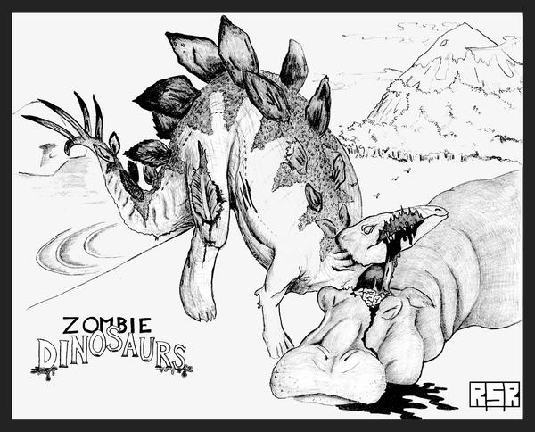
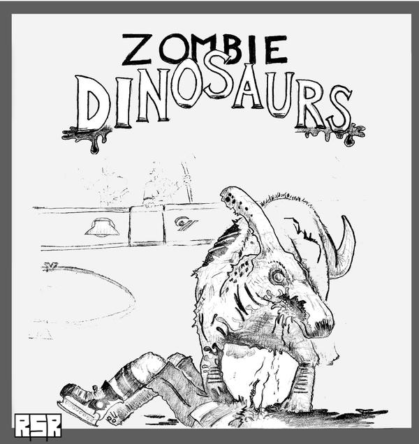
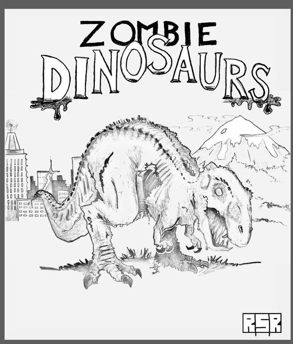
Dinosaur Zombies, on the other hand, I have had a chance to experiment with (like the zombie brachiosaurus, zombie stegosaurus, zombie parasaurolophus and a zombie t-rex (and I've got a bunch of neat new ideas on that front!).

So I drafted a quick blurb using his ideas and made a very rough mock-up of what it might look like.


He responded with a thought about omitting any reference to Jane Austen and the "Pride and Prejudice and Zombies" book series, and perhaps have the incoming zombie be a bit more confused about the whole situation. Which I was happy to incorporate.

He'd considered including some of his own existing characters, or adding some dialogue, but ultimately just left me with those two quick thoughts.


He mentioned that he was unsure of his Internet connectivity in the near future, so I set to work the very next morning to get it on paper, and ready to be coloured right away. My wife was really good about it, helping out with our son while I spent a little extra time working on it that morning, just to make sure it was ready in time.

The outline looked like this. With so many characters in the scene it was a great opportunity to tell a few stories at once, and I think it worked out well.


There's Mother, The Castigator, The Idiot and the Zombie. Everyone's story moves forward just a little bit, ironically, except for the subject of the joke, The Idiot, who is just taking everything in as it happens.

I had a fun strip earlier where there was some story development for a series of characters in a series of scenes that went with the King St. Capers - - which you can check out if you'd like.

Ultimately, this type of a strip is a LOT of fun to draw and write. There's so much going on that it leads to multiple readings and a series of different elements of humour. A real favourite.

Then there was the colouring!


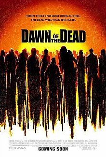
I wanted the window to resemble (in part anyhow) the Dawn of the Dead (2004) DVD artwork, and I think it translated nicely.

Last step was the lettering to make the final product which you can find HERE. I hope you liked it.

Thanks again to my wife for helping make it happen, it would have been a real struggle without her support.

Friday, July 19, 2013

Behind the Scenes of Whatever Happened To ....

Whatever happened to that shy archaeologist from Pennsylvania? This scene is a moment for Dr. Bolam and Dr. Miller to take stock of their situation, and sort of reflect on their journey so far, and perhaps for the readers, too, to think back on how he's changed and grown.

Follow on Twitter or Facebook!
That was the hope, anyhow. Plus, I needed a segue that helped carry them from Cyprus to Turkey, instead of just saying, "Later, in Turkey."

I hope when you look at this, you can see and feel that it's a time for reflection and perhaps even personal introspection, as no doubt Dr. Miller has to realize his life will never be the same from now on.

really rough, hardly any background

Sometimes when I enter a new scene where I have to create a whole new environment for the characters to exist in, like the slaughterhouse earlier. I'll do a lot of web browsing to pick and choose how the areas should look and try and envision the mood I'd like to be captured.

And then there are scenes like this, where I just pencil in where in a panel I want the characters to stand, and then I just fill in the background and setting way afterwards, hoping that the lack of preparation doesn't bite me in the ass.
basically just blocking


Another challenge is to try and draw some parallels between where the position of the sun is in each sequential scene. I've become acutely aware of how many dark, late night scenes I've drawn, because it's put a great strain on my 6B pencil. It's getting more use than Aaron Hernandez's lawyer.

So I was eager to get into the daylight again and have some nice scenes outside. I'm getting back to that now that they're out of the slaughterhouse and back in transit to a new country and a setting that we haven't visited since Act I, way back in the early days!

Sometimes I feel like I'm not honouring the process enough when I skip over the rough-sketch stage, and no doubt, it'll come at a price. I just felt a bit rushed and wanted to offer an update. The pacing over the summer is a challenge because we've got so much more going on (or so it feels, anyhow).

Friday, July 12, 2013

Concept Art | Business Man @ Home

Behind the Scenes of creating the new series, Business Man @ Home

The Premise: "Business Man @ Home" is a cathartic exploration regarding how toddlers are absolutely vacant of any professionalism whatsoever.

Follow on Twitter or Facebook!


Here are some of the thoughts I had on designing this new series.

So here is some of the concept art I threw together when I was thinking up what I wanted Business Man @ Home to look like. To keep it simple (read, fast to make) I wanted to retain a real minimalist appearance, and not get too bogged down with backgrounds and things like that.

In my head, I had "Herman" in mind, and jotted down Jim Unger's name. By that I mean, a single-paneled gag without too much attention to the background. Like this:
Herman is so funny!
I took a little time to draft up the Header for the comic, too - - which I felt would be neat if it resembled a corporate ID badge, similar to this:

The bar code, picture and details are featured in the header.
And the design for the main character was meant to imply a very menial job, but one that has to be taken seriously, anyhow. Maybe it's in sales or whatever, or "account managers" but I really wanted to make the characters look like that dude from the Men's Room door.


But of course, he must appear more "professional," so he has a jacket and tie to go along with it. Of course!

I hope you like it!

In a way, there are some similarities with Bill Taylor's Cautionary Tales that embraced a "caution sign" aesthetic to tell its jokes. I hope this can be half as interesting as what he has accomplished.

Anyhow, if you ever have any questions, feel free to ask - - I'd be happy to respond. 

Sunday, July 7, 2013

Kodikas Galanos and balancing panels

Code Blue - - which in hospital slang is generally used to indicate a patient in need of immediate medical attention. Switch that into Greek, Cyprus' national language (along with Turkish, I understand) and you've got the name of the latest scene, Kodikas Galanos.

And not to be too confusing with the language switche-r-oo, I even made a point to specifically point out that Blue in Greek is Galanos way back on page 130. So that's where the name comes from, if you were wondering.

Once again, I wanted to keep the scenes short, for two reasons; first, it quickens the pace of storytelling, which is more exciting for readers (I hope) and second; it's more interesting for me to write and draw these scenes when they don't take a whole month to produce.

I hate drawing cars - - I totally avoided even sketching a car in this page. I just hate it.
I felt in an earlier scene that the downpouring rain turned out nicely, or at least accomplished what I hoped it would visually, so I was eager to include it again, and this seemed like as good a time as any. There was no call for rain in the script.

The script did, however, feature more gesticulation and language barriers between the motorist and Ian Escutcheon, but ... again ... for the sake of brevity, I eliminated that. Perhaps it would have been better if this were a more comedic moment, but the urgency I was hoping to imply didn't allow for it.

I couldn't fit the image into a quarter panel at the top, so I turned it into a banner-shape on the fly.
Sometimes the images don't fit, and instead of redrafting them, I just change it on the fly, without even erasing the guidelines. It doesn't feel necessary to be too refined in a quick draft. What's most useful when I'm putting these draft pages together is finding a way to share the images in a balanced manner.

For example, in the above page, four consecutive square panels might have looked a little to "geometric" or "blocky," and could have been a visual distraction. That might be useful at some point, but it didn't feel like a natural fit in this scene.

If I understand correctly, most comics writers draw on much larger sheets of paper, and then they're scaled down to fit into the standard comic book format, whereas I simply use 8.5"x11" common stock paper. When you've got a larger page, you have more room to do creative things with the panels, and add a lot more detail, which is later shrunk down into a really fine piece of work.

It'd be neat to try some time - - in fact, I actually used one and a half pages to draw this page: 
 
Follow the link to get a closer look, but I meant to put a LOT more detail into this page, because I wanted to really impress the spectacle of entering the Church of St. Lazarus. I think it turned out really well, though, if you look, in the middle panel amidst the seats, you can see the seam where I married the two pages together to complete the final image.

At first glance, I'd hope you wouldn't notice it - - granted, now I've pointed it out, it probably sticks out unavoidably.

The reason I did this was because I wanted the three saints hanging on the wall behind Dr. Miller to be more detailed than a small panel would allow. If you're familiar with your old saints (I'm not, but IF you are) you might recognize Saint Demitrius, Saint Moses the Black and Saint George the Dragon Slayer.

I think the added effort was worth while.
I wanted them to appear as faithfully as I could reproduce them. When they're just the size of a half of a dime on the original page I'm working on, it's hard to include any more detail than a mere shadow. Taking the extra time to draw them much larger than usual, and then shrinking it down, made all the difference.

ALL of that being said, finding a nice balance on a small page can sometimes be a challenge, I guess that's what I was trying to say.

Thanks for checking in - - if you have any questions, let me know, I'll be happy to answer them.


Saturday, July 6, 2013

I Plagiarized a Joke From My Cat

I plagiarized a joke from my cat - - just another insight into the makings of some of these stupid jokes. I'll tell you more about the cat's joke in a sec.

First, here are a few more behind-the-scenes glimpses into the making of the King St. Capers and other terrible comic series.

Once again, this sneak-peek reveals my hopes to be efficient is drawing four comics on a single page, which keeps the images small, the resources small (fewer sheets of paper to sort) and the images small when I go to add colour in the final steps.

Plus, it saves on scanning multiple images, too. It's one sheet of paper, slipped into the scanner, and presto. Sort of.

Great Idea, Quarterly Review, Cat Sniffs, and Failed Bumper Sticker.
So, here you see the hilarious Caper that I've not released yet. There's no caption on the image, so you'll just have to wonder what on earth might be being said in that panel. Also, an illegible note for ANOTHER Caper idea is just sitting there on the page, but you can't read it!

So TWO Capers are potentially being spoiled early, but I trust they'll still be a bit of a surprise when they're finally released. Stay tuned.

Also on the page are three other comics which have all been posted now. I'm most excited to introduce "Business Man @ Home," which is a new series that's serving as catharsis in my continued observation of how a one-year-old is lacking any professionalism whatsoever.


I took a little time to do some product development, and drafted up a fun banner to include on each strip, and I hope people will enjoy it. I think there's plenty of material to continue the series for a while, plus they're quick and easy to execute, which is imperative!

Next is Most Interesting Thing in the Room, starring my cat Indy. She's been the artistic template I've used to create this cat. She also basically wrote this joke. Indy has discovered that my armpits quickly become a crack-heroine version of catnip to her, and she wants to rub, snuggle, scratch and claw at them whenever she can. It tickles.


Lastly, was just a dumb bumper-sticker idea I figured would be terrible. That's how my sense of humour/mind works, it flawlessly takes information and then finds the worst possible scenario that would create the most intolerant and awful outcomes ever, because for some reason I think that's funny.

It's never a constructive thought. It's never a positive thought. It's without fail, always the worst thing possible  - - and then I laugh to myself, and people ask me: What? And then I've got to change the subject instead of reveal my awful thoughts.

I figure one of the nastiest practical jokes you could play on someone would be to take a really offensive or dangerous bumper sticker and put it on someone else's car. Who knows how long they'd be driving around getting dirty looks and being identified with whatever dumb thing you've written on their car?

Hilarious, right? That and emptying a hot deep fryer on the hood of someone's car. I imagine that'd be pretty crazy, too.

I hate drawing cars, so I just stuck the sticker onto an existing image of a car. Man I hate drawing cars.